
The air in New York has once again turned hazardous due to wildfires in Canada. In 2023, the city’s sky turned orange, Mars-like. I decided to turn the event into a project, to better understand air quality metrics and data.
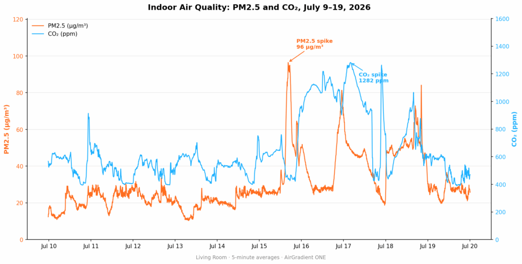
I have an indoor air quality sensor, which I’ve compared to public readings of two key air quality metrics: Particulate Matter 2.5 (PM2.5) and Carbon Dioxide (CO2). Here’s a visualization of the raw data from my living room sensor for July 9–19:
Behavioral Events
On July 15th, PM2.5 readings reached their highest levels. So I took my indoor data and compared it with publicly available data. While the sampling resolution isn’t identical — my indoor readings are 5-minute averages, while the outdoor reading is an hourly average across 13 public monitors — the chart tells an unusual story:
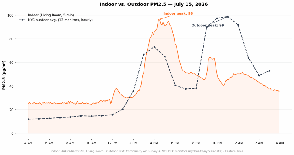
During midday hours, the PM2.5 reading in my apartment — despite running two HEPA air purifiers — was worse than the outdoor reading. Why? Cooking. The windows were closed both during and after the stove was used. Gas ovens produce nitrogen dioxide (NO2), which is linked to asthma. Unfortunately, my sensor doesn’t measure NO2.
The following chart depicts indoor CO2 readings:
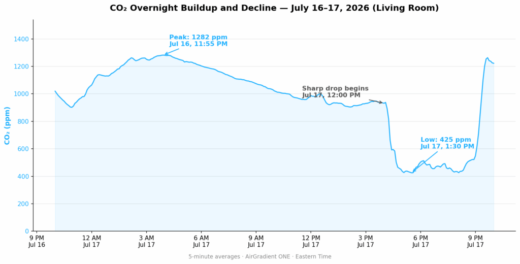
In the home, CO2 is generated mainly by exhaling. Two events in the data make this clear:
- Overnight, CO2 readings climbed higher because everyone was home and the windows were closed.
- CO2 dropped sharply late the next day, once we left the apartment.
Next Steps
A few takeaways from this analysis:
- First, on days when outdoor air quality is poor and windows need to stay closed, ventilate well when cooking with gas — use a range hood or exhaust fan to avoid compounding the problem indoors.
- Next, I need a better way of annotating events in the data — manually cross-referencing photos isn’t efficient. I’d like to automate event tagging somehow.
- Finally, to better understand the impact of gas cooking on indoor air, I need to add NO2 measurement to my sensor stack.