Last year, several software developers on my team began using Databricks for various projects. To better understand its capabilities, I started experimenting with the Community Edition. While I’m excited about the potential of building agentic products using Agent Bricks, I decided to stick to the spirit of “pragmatic incrementalism” and start with something foundational: simple data analysis for IoT sensors.
The Use Case: Air Quality Monitoring
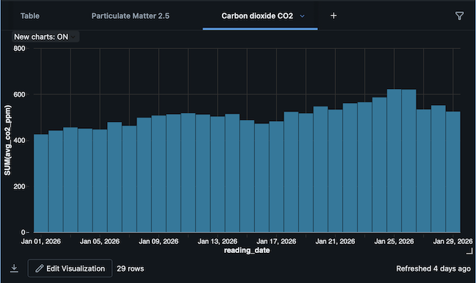
As part of my ongoing work on Ayer, I purchased an open-source air quality sensor about eight months ago. Since integrating indoor air quality data is on the product roadmap, it served as the perfect pilot for Databricks. I created a notebook and wrote a Python script to fetch, ingest, and transform the sensor data, ultimately calculating averages and rendering the analysis in an interactive chart.
Overcoming Technical Constraints
Because the Databricks free tier restricts external API requests, I developed a Python “bridge script” on my local machine. This script fetches the sensor data to my Mac, generates a JSON file, and pushes it to the analysis notebook.
Data Pipeline Overview:
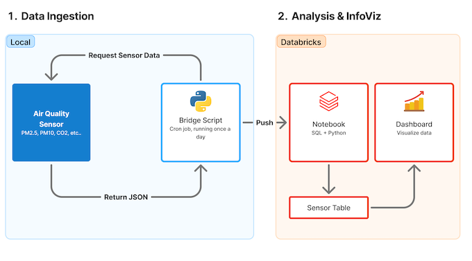
Automation & Visualization:
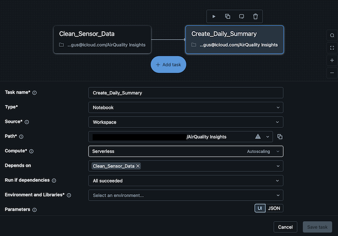
To further automate the workflow, I used the Jobs & Pipeline feature to create a two-step pipeline:
- Task 1: Normalizes the incoming raw data.
- Task 2: Runs the analysis and updates the visualization.
Task Configuration:
Final Visualization:
Next Steps
Getting up to speed and learning productive workflows on Databricks will take time, but building this demo was surprisingly straightforward. The next phase is to formally incorporate this air sensor data into the broader experience strategy and product design for Ayer.