On a flight into New York’s LaGuardia Airport, I came across a water fountain unlike any I’d seen before. It had no buttons.
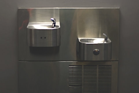
At first, I thought it was broken. Where’s the button? I wondered. The only thing visible was a pair of small holes. I waved my hand in front of them, and to my surprise, a motion sensor activated the flow of water.
This fountain was “smart”—a touchless design most likely introduced as a public health measure to limit the spread of viruses like H5N1 (Bird Flu). But as a student of human-centered design at the time, I couldn’t help but notice the problems in how it was presented.
The issue was simple: the fountain lacked visual affordances. Nothing about its design gave first-time users a clue about how to use it. Out of curiosity, I stayed and observed how others interacted with it.
- First, a man approached. He looked at the fountain, hesitated, then moved on to the second fountain nearby—the one with a big, familiar button. The “smart” fountain had failed him before he even tried.
- Next, a young woman approached. She placed her finger directly on the spout, assuming that must be the trigger. The sensor activated, water gushed out, and her finger blocked the stream—leaving her with a messy experience.
In both cases, the fountain undermined its own purpose. What was designed as a hygienic, health-conscious intervention instead left people confused or frustrated.
The fix could have been simple: a small sign or sticker to orient users, helping them reconcile past expectations with this unfamiliar interaction. A small visual cue could have bridged the gap between “smart” technology and real human needs.