Acquiring a skill, mastering that skill, and finally discerning how well that that skill is used by others can be a frustrating experience. It’s frustrating because discernment, eventually, allows you to intuit the trade-offs, limits, and compromises that characterize the object of discernment.
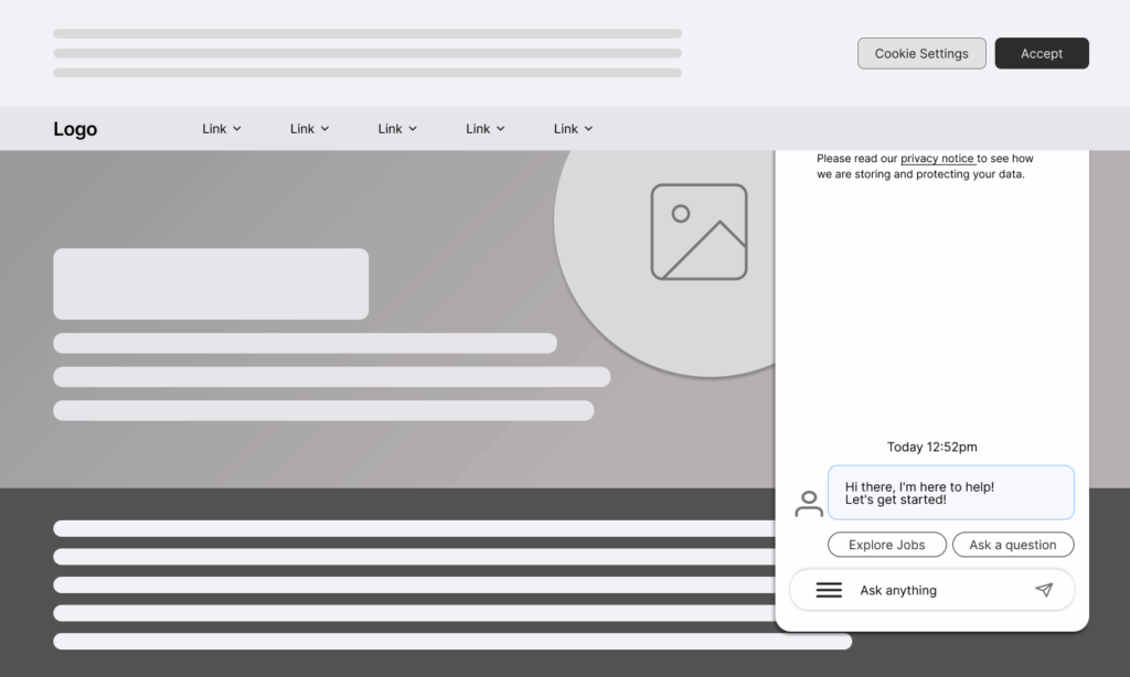
In my case, that skill is user experience or product design. I came across a home page yesterday, while researching Growth Operating Systems, that was disappointing. I won’t call out the website, but here’s a wireframe of the homepage for reference:
And the sections highlighted in red are the main problems:
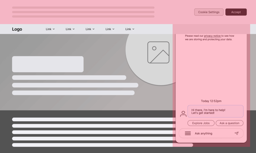
A few observations:
- Cookie Consent has been placed at the top of the website, which places too much importance on a setting that, for many, is rarely top-of-mind. Perhaps the intention was to treat consent like a notification by overriding top-panel design patterns? This approach is atypical.
- The AI Chatbot Panel automatically expands, which I understand. AI is important – if a company wants to be taken seriously, they have to offer some level of AI. The panels automatic expansion captures your attention. But the AI Panel appears below the cookie consent panel. The Chatbot title and controls are invisible.
My gaze was effectively stranded. I began wondering what a heat map, from eye tracking usability tools, would look like.
The experience was so compromised, I stopped researching the topic and decided to write this blog post. With all of the web design guidance available and design systems, I assumed a certain level of usable was standard. Apparently not.