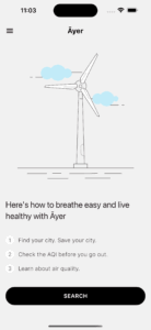
Āyer | አየር
noun
- An air quality app by Amha Mogus.
- A term that means air or atmosphere in Amharic.
Context
In June 2023, wildfires in Canada created hazardous air quality conditions across large parts of North America. Overnight, pollution and air quality became the leading story. What began as a public health crisis soon evolved into a personal project.
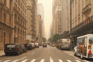
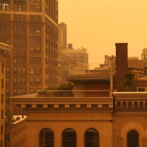
When forecasts predicted extremely hazardous air in New York City, I grabbed a mask, a camera, and set out to document the moment. The photos capture the city’s transformation from a fog-like haze into an orange, post-apocalyptic landscape—images that are as striking as they are unsettling.


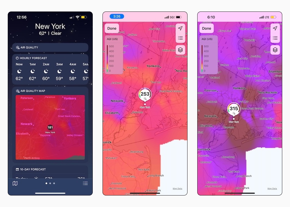
At the same time, I noticed that weather apps had started including air pollution data. To track the unfolding story, I took screenshots throughout the day, layering news coverage with firsthand observation. Air pollution levels were measured through the Air Quality Index.
What is the Air Quality Index?
The Air Quality Index (AQI) is a standardized measure of air pollution, expressed on a scale from 0 to 500. Each range on the scale corresponds to categories that outline potential health impacts and recommended precautions.
Governments, international organizations, and third-party platforms all report AQI, yet I was struck by how little awareness I personally had of it. On the iPhone weather app, for example, AQI data exists—but it’s buried so deeply that unless you know where to look, you might miss it entirely.
That experience made me think about how to make air quality guidance easier to access and more relevant to daily life. While the information is widely available, its presentation is often confusing or inaccessible. This creates a barrier to understanding, limiting both its impact and the chances of meaningful behavior change. My goal became to help close that gap.
Objective: Productive Personalization
Product Design, like any profession, will evolve as AI adoption grows. The dominant narrative is augmentation—AI as an enhancement to human capabilities.
For me, though, AI signals something more: productive personalization. In practice, that means approaching problem-solving with greater exploration and flexibility. As Product Design (and CX/UX design more broadly) has matured, it has also become weighed down by process. AI offers a way to cut through that bloat and return to more fluid, personalized ways of working.
This personal project, Ayer, is an attempt to define a new product design process—one rooted in conceptual architecture and accelerated through rapid execution with AI.
Process
I think of myself as a creative-analytic—a cognitive style that approaches problems from two perspectives. Creativity is informed by analysis, which feels natural. Many design frameworks, like the Double Diamond, articulate this balance well. But in practice, more time tends to be spent on analysis. That bias makes sense: analysis is easier to tie to business objectives and cross-functional alignment.
For this project, I used a mind map to frame the concept and define the product architecture. The map captures data models, user flows, screen structures, and hypotheses to validate through user research. In short, it’s both a summary of my understanding and a blueprint for what I want to build.

How I built Ayer
My main goal was to use AI as a way to gain end-to-end product development experience—building and designing in parallel. I worked with Cursor AI and Dart/Flutter, aiming for a functional output rather than a polished, production-ready product.
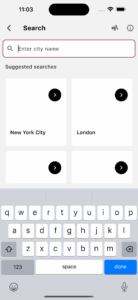
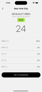
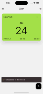
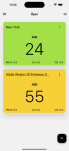
The design follows platform conventions to leverage familiarity and improve learnability. Functionally, the app allows users to create and manage a list of cities, with air quality data displayed at both the list and city-detail levels.
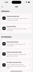
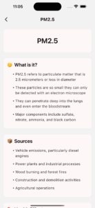
To encourage deeper engagement, the AQI section includes a brief introduction to key pollutants and their causes. The screens began as high-fidelity sketches, which I iterated on and refined with the help of AI.
Tools
Screen shots of the Ayer app, taken from the iPhone simulator.

Challenges and considerations
Two main challenges emerged during this project: data resolution and limited user engagement opportunities.
Data Resolution
While AQI data is widely available through multiple APIs, the sensors that generate it are often located far from where people actually live and work. This raises questions of relevance: if the data doesn’t feel truly hyperlocal, users may lose trust and disengage. Air quality is also shaped by complex factors such as wind patterns, which adds further uncertainty.
User Engagement & Guidance
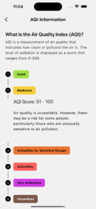
AQI categories are mapped to general public health recommendations, but these tend to be broad and not particularly actionable—especially for groups with heightened lung sensitivities. The current recommendations are often too generic to be useful (see table below). Organizations such as the American Lung Association may offer more specific and relevant guidance, which could be integrated into future iterations.
| AQI Value | Status | Description |
|---|---|---|
| 47 | Good | Air quality is satisfactory, and air pollution poses little or no risk. |
| 52 | Moderate | Air quality is acceptable. However, there may be a risk for some people, particularly those who are unusually sensitive to air pollution. |
| 129 | Unhealthy for sensitive groups | Members of sensitive groups may experience health effects. The general public is less likely to be affected. |
| 176 | Unhealthy | Some members of the general public may experience health effects; members of sensitive groups may experience more serious health effects. |
These challenges highlight the gap between what’s currently possible and what users actually need—setting the stage for exploring the shift from the current state to a more effective target state.
What’s built. What comes next.
The following table represents my road map. The two key priorities for target state are IoT integration and a concept redesign (e.g. items below).
| Current State | Target State |
|---|---|
| 2.0 Dashboard Screen | 1.0 Authentication |
| 3.0 City Search Form | 2.1 Redesign dashboard views |
| 3.1 Search Results Screen | 5.1 Global AQI Rubric |
| 4.0 City Details Screen | 6.3 Tips / Guidance |
| 4.1 Save City to List | 7.0 Integrate IoT |
| 4.2 Remove City from List | 7.1 Indoor air data |
| 5.0 Data modeling | 7.2 IoT Device Control / Mgmt. |
| 6.0 Learning | AQI Concept Redesign |
| 6.1 AQI Basics Screen | iOS / Android Widgets |
| 6.2 Air Pollutants Screen | AQI Sentiment Analysis |
| Welcome Animation | Use Testing |
| Dark mode |
Note
This case study captures the first iteration of Āyer — from the initial spark to a working prototype. In the next update, I’ll share how I mapped user personas, journeys, and feedback, along with a competitive landscape and framing that broaden the story from concept to impact.
Get the code at GitHub
I published the project to Github, where you can download, build, and run the project.